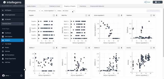
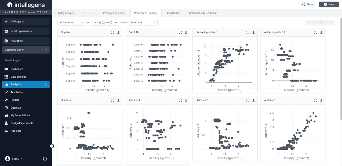
The Property vs Property plots allow you to view relationships between any given columns in your dataset. The plots display a column on each axis and now an additional column can be displayed in colour. Alchemite generates trendlines based on your data to be used for easy and quick predictions.
You can:
- Get insights into your data by discovering relationships that you didn’t know existed
- Easily identify outliers in the data
- Explore data by zooming in on plots with large numbers of data points
Learn more
The Property vs Property dashboard view generates a series of plots that show how one property (Density) varies with each of the other properties in the dataset. You can get a quick overview and select which property combinations you want to investigate further.
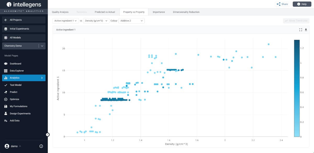
Here, the user has selected one plot, showing the variation of Density with the percentage of a particular Active Ingredient (1) in the formulation. The new colour feature enables the addition of another dimension to the chart, highlighting those formulations that also have a high content of Active Ingredient 2.
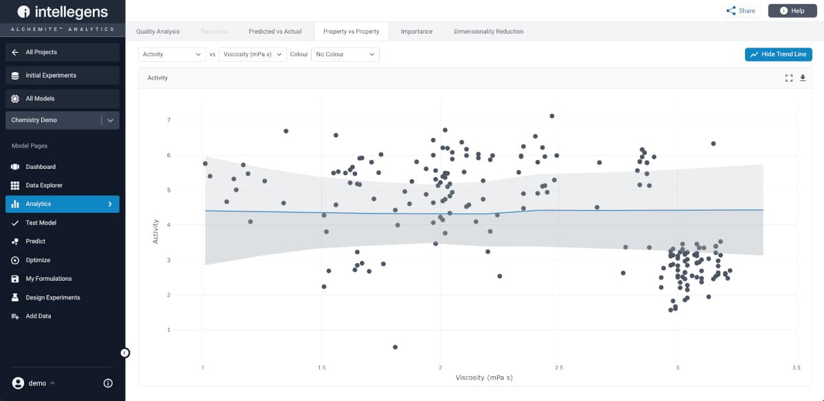
It is also possible to add trendlines to the plots, showing the model’s understanding of what is going on in the dataset and enabling quick and easy predictions.
Get a demo
The Property vs Property chart is one of many analytics features for understanding data and machine learning models within the Alchemite™ Analytics web browser user interface. If you are not currently a user, why not request a demonstration of Alchemite™ Analytics tailored to your application area?