Alchemite™ Suite offers a wide range of graphical analytics enabling ‘Explainable AI’ – helping you to understand the insights into your data that the machine learning has uncovered, and to apply those insights to optimize the properties of your materials, chemicals, formulations, or processes. This library is being expanded all the time. Here are some of the analytics added with the launch of Alchemite™ Suite in early 2025.
All of these analytics are selected and developed in collaboration with Alchemite™ users, ensuring that we are constantly enriching the Alchemite™ experience with the tools that these users actually need.

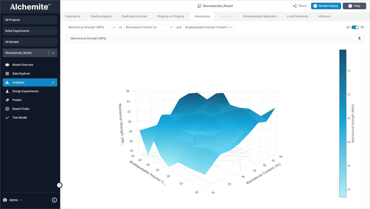
Interactions plot (2D and 3D)
The Interactions plot shows two inputs against one output and helps better understand complex relationships and interactions that might not otherwise be apparent. Great for understanding the interplay between factors in formulation, material, or chemical design. By default the plot is a 2D contour plot (shown here) – you can switch to a 3D plot.

Influence plot
The influence plot shows how each input impacts a specified output. Inputs are listed on the vertical axis, ordered by importance by default. The horizontal axis represents the influence of each input on the specified output. This helps you home-in on the key factors controlling the objectives that matter in your development work, focusing your thinking and experimental work.

Local sensitivity plot
The Local Sensitivity plot compares two data points and explains why the prediction from Alchemite™ of the output differs between these points. For example, comparing a result from Design Experiments and a high-performing result from the training dataset can help you understand why Alchemite™ suggested this experiment, as it shows which inputs are driving its performance.
